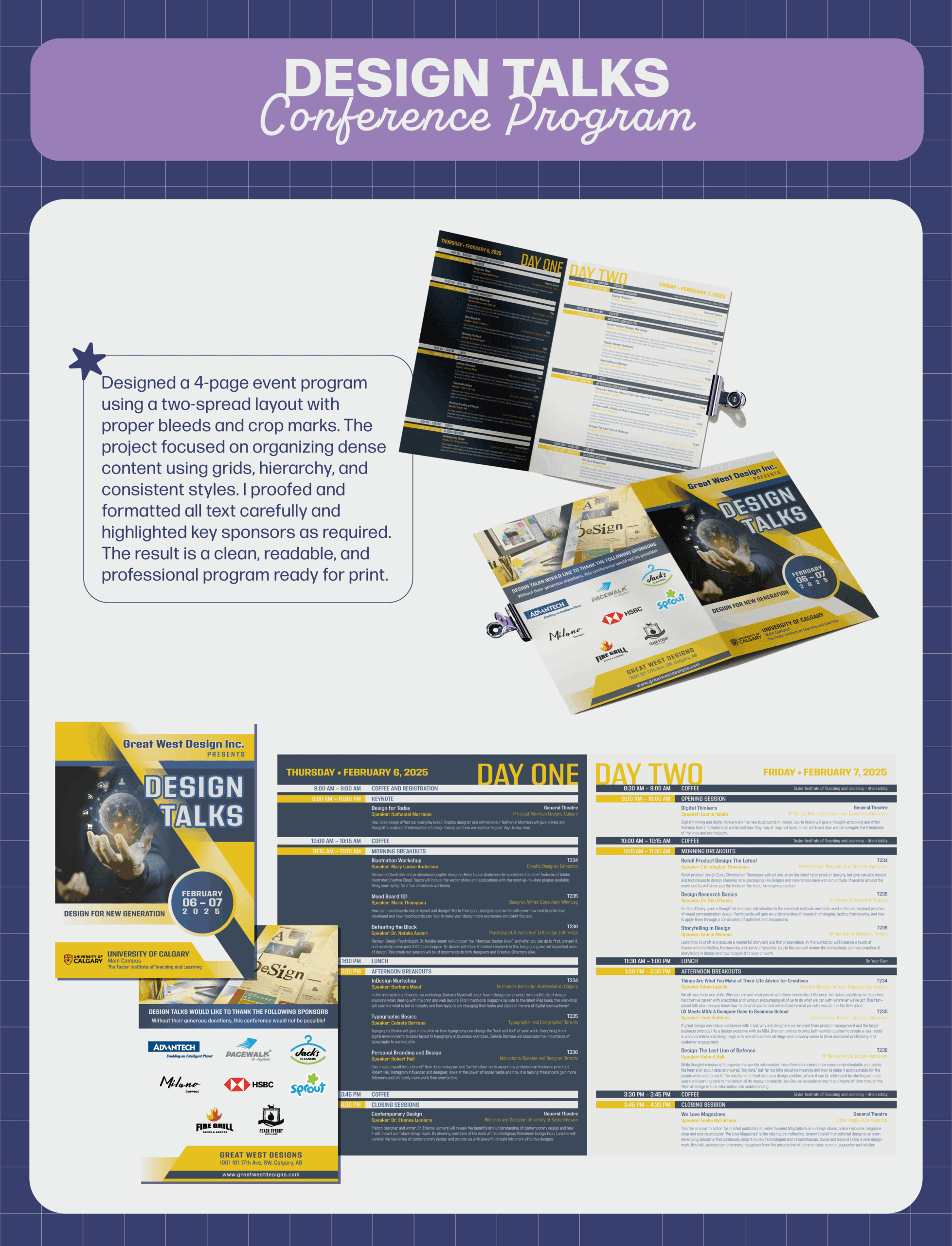
Conference program design
Design Talks
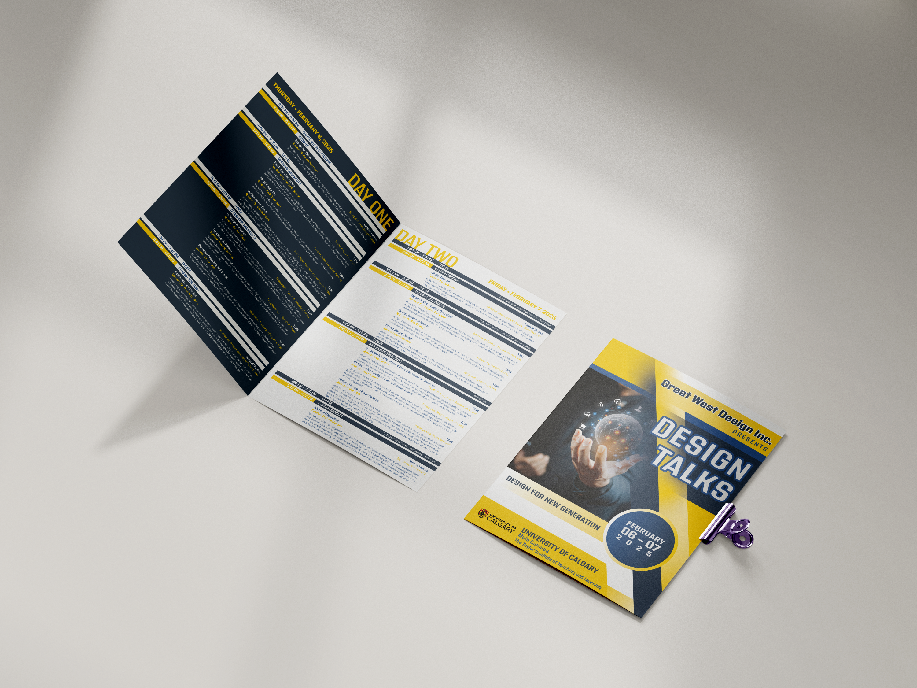
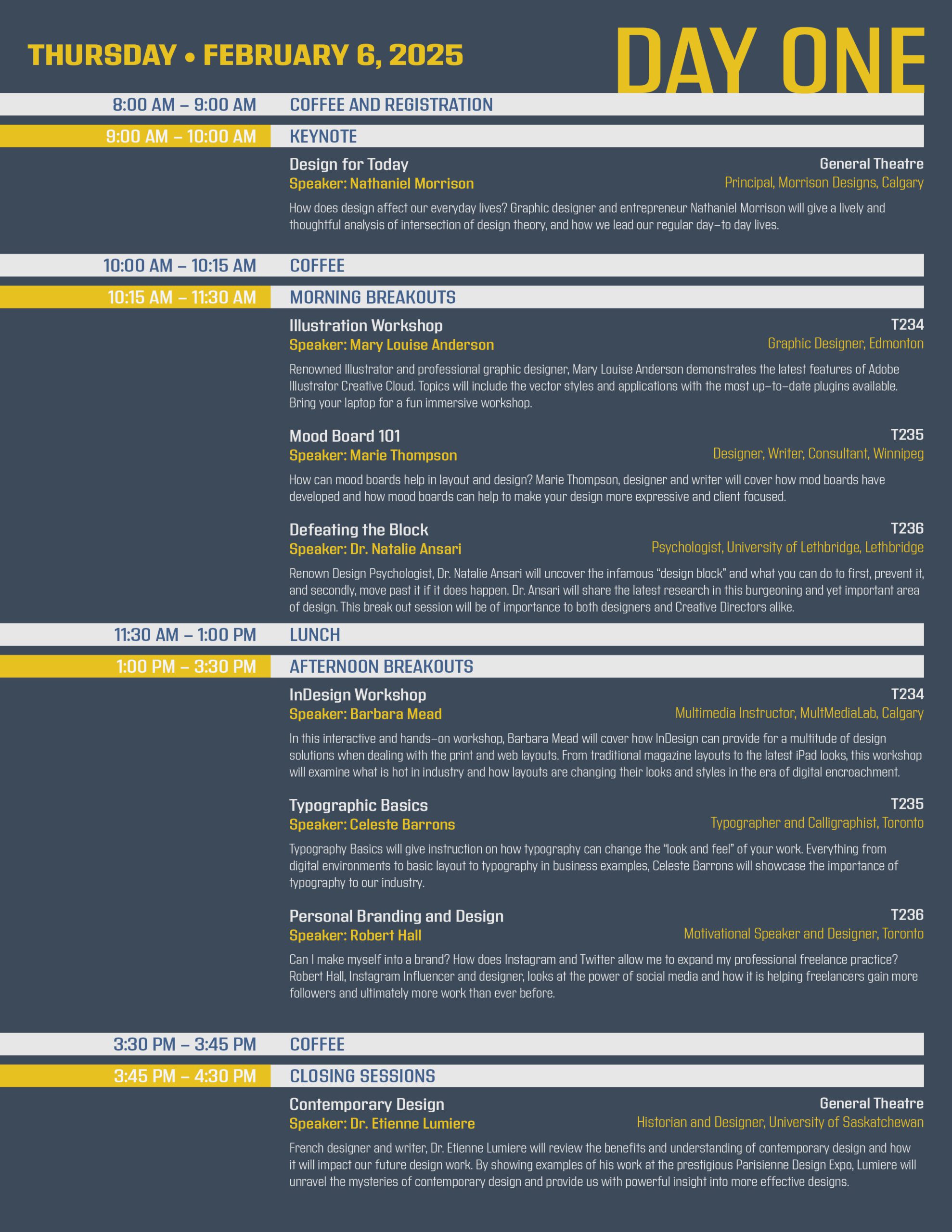
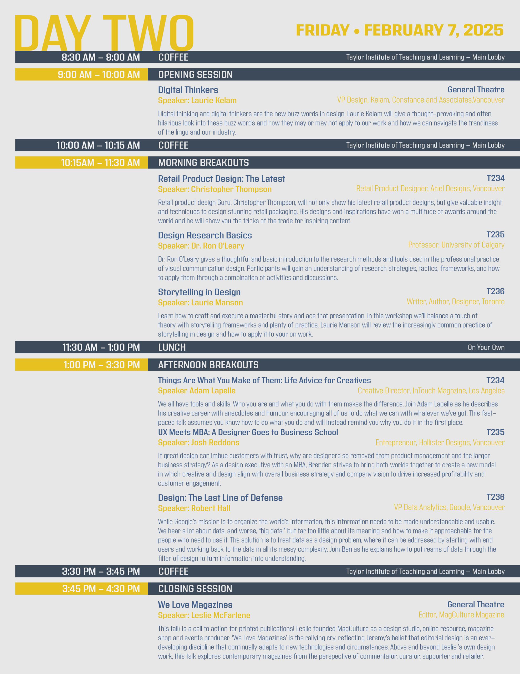
For this project, I designed and fully edited a 4-page Conference Event Program following professional print standards. The layout was built using a two-spread format (2 pages per spread) with a .125 inch bleed and active crop marks for accurate trimming.
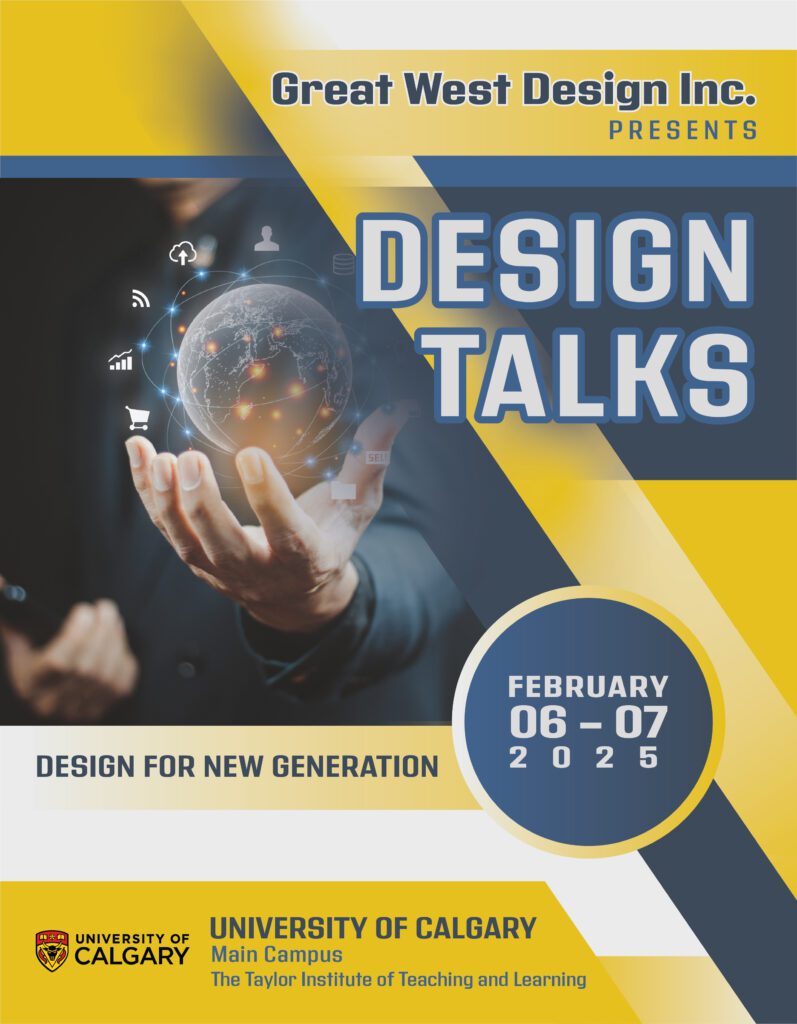
I began by sketching a wireframe to organize content placement and ensure strong visual hierarchy. I established a grid system and used paragraph and character styles for consistency and efficient formatting. The program features a cohesive design with careful attention to typography, spacing, and alignment. The front and back covers were designed with visual appeal and brand consistency in mind, while the inner spread focuses on a clear and accessible conference schedule layout.
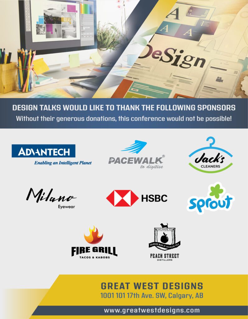
All provided content was proofed thoroughly for spelling, grammar, and formatting. Sponsor logos were prioritized according to hierarchy, with named sponsors prominently featured as instructed. This assignment emphasized clean design, attention to detail, and efficient editorial workflow.
Designs that make an impact
Let’s Create Something Amazing!
Got a project idea, collaboration in mind, or just want to say hi? I’d love to hear from you! Whether it’s branding, illustration, or just geeking out over design, let’s make something awesome together.